Client email - signing off design for final postcards
- Jun 5, 2017
- 4 min read
Date: 5th June 2017
Progress of brief: Finalising artwork/preparing for print
Issues discussed:
- Any details or changes Penny would like to make to the final postcard design
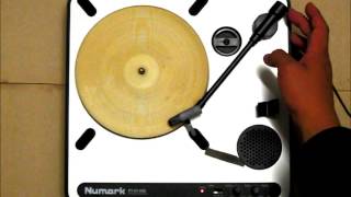
- Potential issues with print production - I sent Penny an image of the first draft when printed on ivory cardstock on the large format printer to show the colours
- I amended the postcards based on Penny's suggestions and sent them back to her
other:
- I mentioned a few points about the project - how the postcards would be stored and placed on shelf (slipcase/wrapper etc.)
- Also considering how a releasing the postcards would go against the label's ethos - nothing they produced was intended to be a collector's item
Client feedback:
Penny was happy with how things have progressed. She also mentioned as a sidenote by playing around with different visual styles, I wasn't considering the client's needs - I'll keep that in mind.
Action points:
- Make revisions to the postcards that Penny pointed out (done and sent back within two hours). Penny suggested tidying up the type around the centre hole
- Look into creating a wrapper band for the postcards to explain about the label and to protect the record grooves (at this point in the project may just be initial sketches)
My next tasks:
- Create a video of the animation on the final postcards
- Print and mock up the postcards (die cut central hole / apply spray varnish)
---- Emails -----
On 4/6/17 21:42, "Lisa Wynne" <wynne_lisa@hotmail.co.uk> wrote:
Hi Penny, I've attached the final front and back postcard designs, if you're happy with them, I can get them made up and start filming the final animations (sans banding!). There's also another blog post with a few considerations about how to tie the postcards all together - mainly a slipcase that would serve to protect the grooves on the record (they're much finer on a postcard than a standard 7" or flexi) and give a bit of back history about the label. Plus the animation needs a bit of explaining! Let me know if there are any changes you would like to make to the postcards. Kind regards, Lisa
---- Reply ----
Sent: 05 June 2017 10:07 To: Lisa Wynne Cc: Alastair Myers Subject: Re: COBC - Sarah Records project Hi Lisa Thanks for sending your artwork for me to see. Fronts: They look super.
Just to check... The output I saw at our last meeting, is that an accurate replication of the final colours? If your final pieces are output as I saw last time then that’s fab!
If they are being produced by another print process, make sure you have an idea of how that process (and the final substrate) will affect the colours. I say this because of your lovely selection of soft tones. If they were to be printed on an uncoated or absorbent stock they may lose a little of their impact.
Backs: Layout pleasing and well organised. No biggies but...
I find the circular type a little too big to read comfortably and to create a neat circle – seems a little awkward – have thought about making it smaller and repeating it with a bullet separator? Birdcage Walk • Birdcage Walk • (see quick attached)
I find the instructions too small for comfortable reading (but I am 100 years old!!) – have you considered a bit less line space between the heading “WATCH THEM DANCE!” and the 1st instruction.
Should the copy mention a record player? As you are bringing Sarah Records to a new generation might the need some help with an introduction to a record player? Perhaps - Place postcard on your record player turntable set to 45rpm. May not be needed.
Nit picking...
Although it is it’s a clear visual message saying ‘post me on’, do you really need the address lines? If so, have you tested writing a range of address into them? My studio address wouldn’t fit the available lines. Do you really need more than the central divide to indicate where folks write the address, do you need stamp box? If you retain it, can the lines be longer? Same measure as the right hand edge of the stamp box?
Lovely work – well done!
Hi Lisa Sorry couldn’t get straight in with this link below but slipcover or deep wrapper band would both work. Slipcase more ‘keepable’ but as they’re meant to be posted on wards perhaps a wrapper band would be a cost effective and ‘keepable enough’ solution? Cheers P
----- Revisions -----
On 5/6/17 12:10, "Lisa Wynne" <wynne_lisa@hotmail.co.uk> wrote:
Hi Penny,
I've attached the revised postcards.

Revisions:
- The awkward type was supposed to be the slight wonkiness you see in typewritten letters (Sarah used them for producing zines). However they were different sizes across each postcard and that bothered me. Much improved, thanks for the suggestion.
- I increased the copy size on the instructions from 5pt to 6pt
- Removed the address lines and put a 'Place Stamp Here' instruction within the stamp area in a lighter grey. Maybe it's insulting people's intelligence but I'd prefer the CTA in there, haha.
- Also added the 'record player' description
I need to have a chat with Alastair about colours - we did some test prints on Friday and got varying results. One was very bright and saturated instead of the muted colours I was going for. More investigation needed!
Kind regards,
Lisa
-------
Smiley face emojis all round from Penny.
Re: colours. It one of those things that needs monitoring otherwise you/client can get a bit of surprise especially if they have seen colour visuals and expect final outcome to be same. Your process seems spot on :-)
--------

Hi Penny,
Final cardstock I have picked is a matte ivory 300gsm card. We just tested it on the large format printer and the colours have turned out fine! If you're happy with it, I can get them printed and mocked up.
Thanks, Lisa
--------
Yay! They look super. Good work Lisa. Happy printing and mocking up!! Top regards Penny


Comments